EASTER OFFER: FREE DELIVERY ON ORDERS OVER £99!**
Delivery Offer Must End Soon!
how to use a colour wheel
Working With Colour: How to Use a Colour Wheel
In this article, we’ll show you how to use a colour wheel to create a brilliant colour scheme for your bathroom.
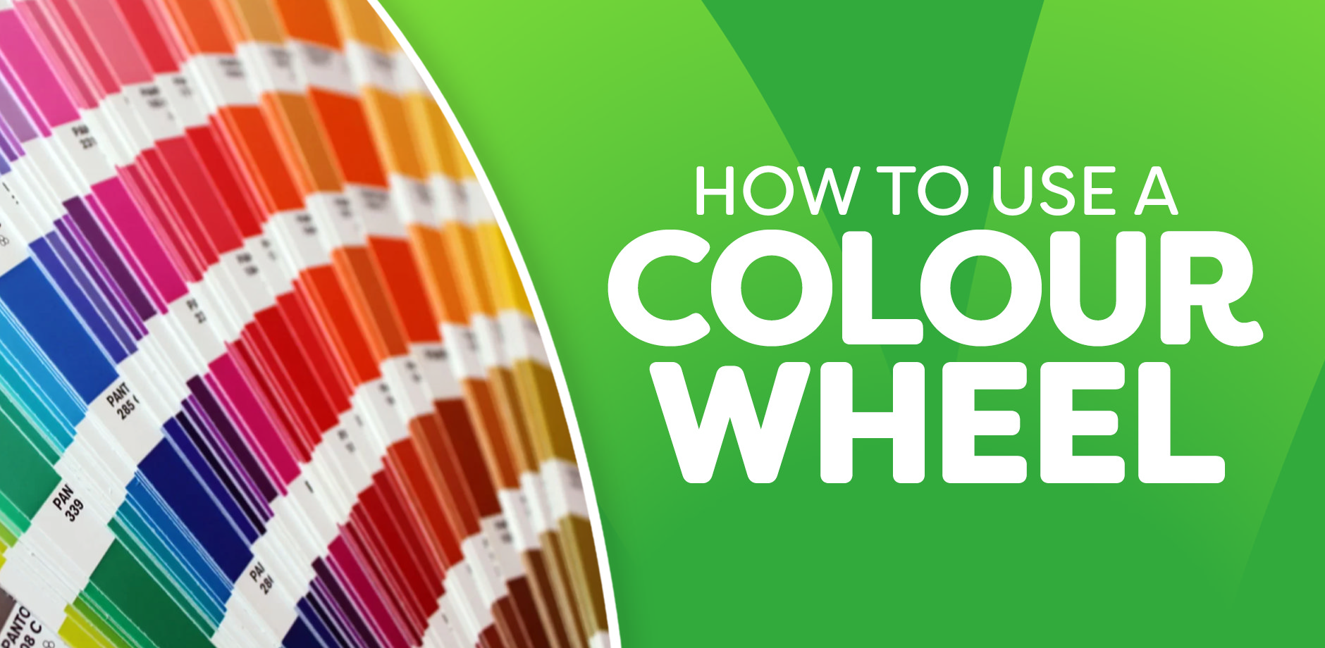
So, first things first, what is a colour wheel and why would you need to use it? Well, as with everything in life, when artists or designers put different colours together to create something that looks visually pleasing, this doesn’t happen by accident. One of the handiest tools in any interior designer’s locker is the colour wheel.
Showing the relationship between different colours in a graphical way, the colour wheel can help anyone look for colours that go well together. It’s ideal when you’re creating new décor, especially in areas of your home like your bathroom, and can be purchased easily online.
In this blog post, we’ll take a closer look at the colour wheel, explain some of the common yet often puzzling terms used when describing colours, and show you how to create your own colour scheme.
The Colour Wheel
In this section, we’ll introduce you to the colour wheel and what colours it contains.
The colour wheel is based around three primary colours: Red, yellow, and blue. These cannot be created by mixing other colours.
When you mix two of these primary colours together, you get secondary colours:
- Blue and yellow make green.
- Yellow and red make orange.
- Red and blue make purple.
From here, mixing secondary colours with primary colours gives you tertiary colours like:
- Red-violet
- Red-orange.
- Blue-purple.
- Blue-green.
- Yellow-green.
- Yellow-orange.
So, to recap:
- You create secondary colours by mixing primary colours.
- Add a primary colour to a secondary colour, and you get tertiary colours.
The colour wheel also highlights Pure Colour concepts:
- Tints: A colour mixed with white.
- Tones: A colour mixed with grey.
- Shades: A colour mixed with black.
How to Use the Colour Wheel
The colour wheel isn’t just about memorising the combinations of primary, secondary, and tertiary colours—it’s about knowing how to mix and match colours for specific effects.
Here’s how you can use the colour wheel effectively:
-
Turn the dial in the centre of a physical colour wheel so that the arrow points to the pure colour in the outer row. The key colour will be displayed in the middle.
-
If you’re working on a monochromatic scheme (using many tints, tones, or shades of just one colour), remember that certain lighting, such as candlelight or evening illumination, can intensify light colours. Using black or black-complementing accents can add emphasis and avoid a distorted look.
By understanding how different colours relate to each other on the wheel, you can create a colour scheme that’s balanced and visually appealing.
Colour Theory Terms

To help you understand the colour wheel, here’s a quick guide to common colour theory terms you’ll encounter:
-
Hue: Another term for a colour—like red, blue, or green.
-
Saturation: The purity of a colour. A colour with high saturation is often bold and intense, while low saturation results in softer, muted tones.
-
Shade: Created by adding black to a hue. For example, adding black to yellow will create darker shades of yellow.
-
Tint: The opposite of a shade. By adding white to a colour, such as blue, you create lighter and lighter tints of that colour (e.g. pastel blue).
-
Tone: Adding grey to a hue creates a tone, muting the colour just slightly.
-
Colour Temperature: Warm colours include yellows, oranges, and reds, which often feel bold and energetic. Cool colours like blues, purples, and greens offer a calmer, more subtle feel.
How To Use The Colour Wheel To Create Colour Schemes
Now that you understand the basics, let’s explore how to use the colour wheel to create your bathroom colour scheme. There are several types of schemes you can try:
- Complementary
- Analogous
- Triadic
- Split-complementary
- Tetradic — Rectangular & Square
- Diad
Complementary Colour Schemes
Complementary colours sit directly opposite each other on the wheel. For example, red’s complementary colour is green. These schemes create strong contrast and vibrant looks.
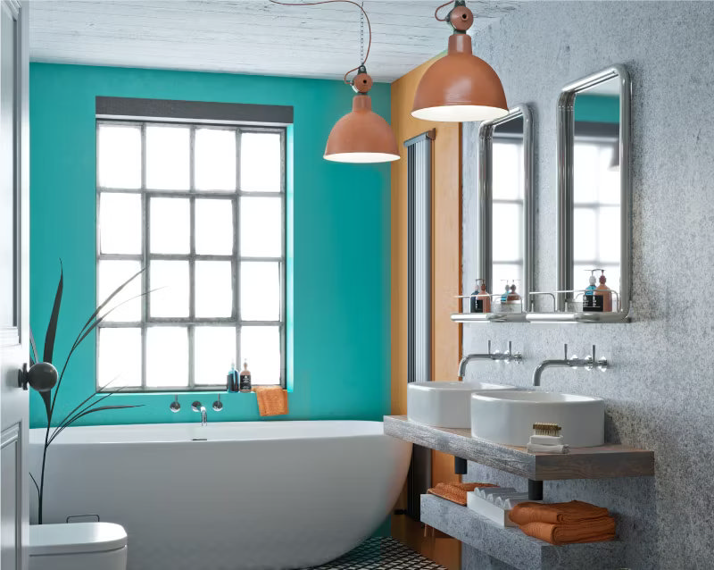
Complementary bathroom colour scheme example:
For a bold statement, try combining burnt orange with vibrant turquoise. It’s a daring look and not for the faint-hearted!
Analogous Colour Schemes
Analogous colours are next to each other on the wheel, like purple, blue, and violet. They harmonise well and are great for creating serene, comfortable designs.
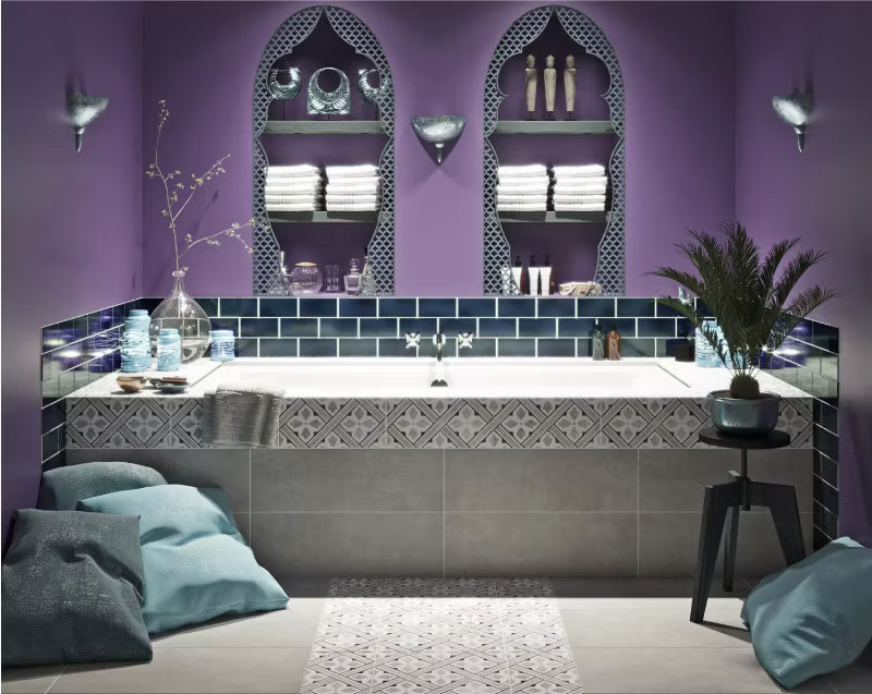
Analogous bathroom colour scheme example:
Purple is the main colour in this look. Paired with deep navy and light shades of blue, it creates a well-balanced, mystical atmosphere.
Triadic Colour Schemes
Triadic schemes use three colours that are evenly spaced around the wheel. A well-balanced, harmonious choice — though it’s often best to use slightly desaturated tones to avoid overpowering the design.
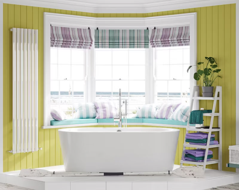
Triadic bathroom colour scheme example:
Green, purple, and orange form a triadic scheme. While you often see blue and yellow working well together, why not push this look further by adding a touch of beetroot pink?
Split-Complementary Colour Schemes
For a split-complementary scheme, you choose a base colour and pair it with the two colours adjacent to its complement. It’s a softer alternative to a complementary scheme but still provides contrast.
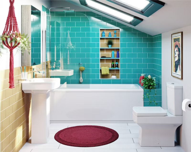
Split-complementary bathroom colour scheme example:
This look adds visual interest without being too intense. By using colours that split evenly, you can create a harmonised yet dynamic design.
Tetradic Colour Schemes (Rectangular & Square)
Tetradic schemes involve four colours that form two complementary pairs, such as red and green combined with blue and orange. These schemes can be complex, so it’s important to balance warm and cool colours.
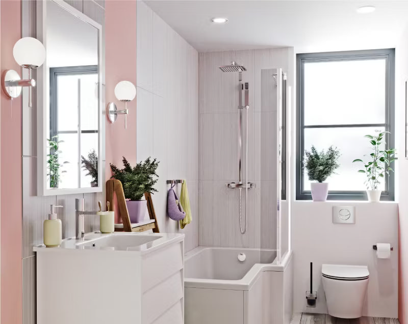
Tetradic bathroom colour scheme example:
I’ve chosen pastel colours for this theme. Since using four colours can feel bold, toning them down with softer hues keeps the look chic and sophisticated.
Diad Colour Schemes
A diad scheme involves two colours that are two steps apart on the colour wheel, such as red and orange, or red and violet. This option provides a softer contrast than complementary schemes.
More Bright Ideas for Your Bathroom Colour Scheme
Feeling inspired? If you’re looking for even more tips and tricks, check out the following articles for more bathroom colour inspiration:
- 25 Green Bathroom Ideas for an Elegant Space
- 20 Luxury Pink Bathroom Ideas
- Make a Showstopping Space with Black and Grey Bathroom Ideas
- 25 Light and Dark Brown Bathroom Ideas
- Small Bathroom Colour Ideas: 10 Top Tips
- How to Choose the Colour of Your Bathroom
- 5 Key Bathroom Colours for 2024
And there you have it — everything you need to boss your bathroom with a stunning colour scheme!

