EXTRA 10% OFF SHOWERS WITH CODE: SHOWERS10
Free Delivery on Orders Over £499**
New Logo
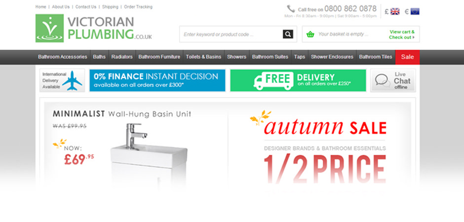
Have you noticed our new logo and subtle website tweaks? Here's a more in depth look at what's changed.

Did you notice anything different recently when you logged onto the Victorian Plumbing.co.uk website? Did something feel dissimilar somehow? Well the observant amongst you may have spotted that our logo has had a slight tweak, nothing too major, just a subtle overhaul that we feel is much improved over its predecessor.
The new image replaces the black font which adorned the previous logo with a more eye-pleasing grey hue, while the ‘splash’ now has its own little box in which to live. The image needed to incorporate the history of Victorian Plumbing.co.uk while at the same time showcasing a visual example of the development of the company. So why the change? Joe Pascoe, Marketing Manager, explains:
“We decided to give our logo a little refresh to reflect where we are as a brand. We’re a big bathroom retail brand now, and we wanted our logo to be unified across all platforms to support the brand identity.
We decided to include the ‘.co.uk’ in the logo as being an online brand is essentially who we are, our focus has always been on selling great bathrooms online, at great prices and we’re happy to see the logo reflect that even more than before. We’ve also given our website a small rearrange to accommodate the changes, we’re getting some great feedback on our new navigation menu and really easy to use search bar; This too has had a lot of work put into improving search results and helping you see the products you’re seeking quickly and easily.”
To reiterate what Joe mentioned, the new logo needed to incorporate the history of Victorian Plumbing.co.uk while at the same time showcasing a visual example of the development of the company. The new image is all part of the constantly changing and evolving online brand. A logo is the symbol at the heart of a brands identity, and it is important that such a key aspect of the website is updated to coincide with the other changes we have been making. We simply couldn’t update the website without giving our logo a cheeky refresh in the process!
One of the things we felt was vital with the redesign was that our customers still felt a sense of familiarity. We don’t want people to feel as though they are on the wrong website, or have to spend time adjusting to radically reworked navigation systems and content. With our new layout, viewers can rapidly access the products they are looking for, making for a stress free shopping experience.
We hope you enjoy the fresh look and find the site easier to navigate as a result. We have made subtle changes to provide the best possible service for our online customers.
If you would like to share your comments or suggestions with us please feel free to do so.
Don’t forget to like us on Facebook and follow us on Twitter @Victorianplumb


